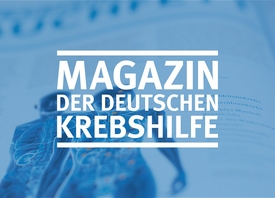
German Cancer Aid Magazine
New design for an established format

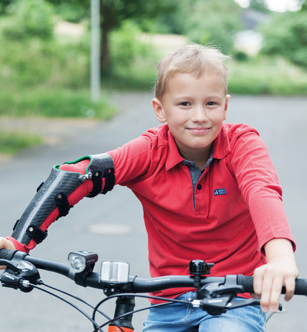

Fresh air
The task
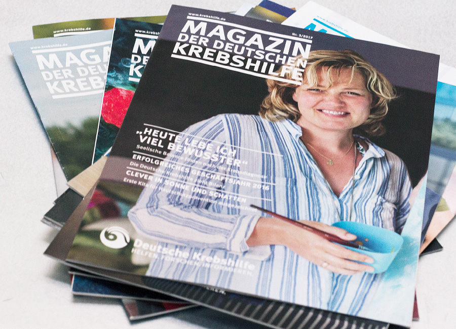
The German Cancer Aid publishes a quarterly magazine for its benefactors. To mark the relaunch of their website, the magazine also received a makeover. The challenge in this task: format and scope are to remain the same, categories and overall concept are to remain recognisable and yet be given a visual makeover. The goal was not a new concept, but rather a continued development.
With attention to detail
Our approach
“The details are not the details. They constitute the design”, said Charles Eames. Following this maxim, we set about modernising the editorial design. How do we expand the design spectrum? How do we create the right interplay of content and imagery and bring a breath of fresh air through the pages? In coordination with the Cancer Aid, a concept is created which is based on subtle changes, retains the character of the magazine and emphasizes its advantages more distinctly.
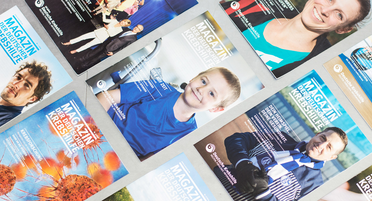
Evolution instead of revolution
The result
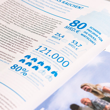
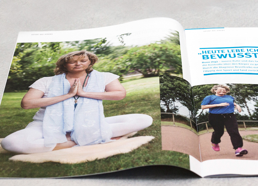
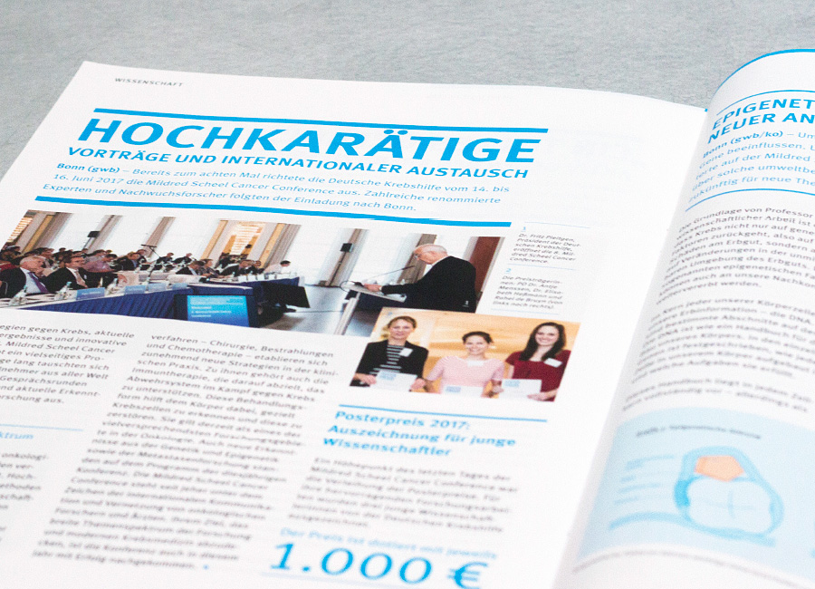
The magazine's headlines and subheadings light up in vivid cyan blue. Personal quotes run through the entire magazine, creating a narrative feature. In the scientific section, the contents are clarified by means of precisely researched and clearly designed infographics. A new illustrative concept loosens up the design grid: Overlapping of the images and more white space create momentum. Orange highlights the “Our Donors” section, where engaging campaigns are presented.
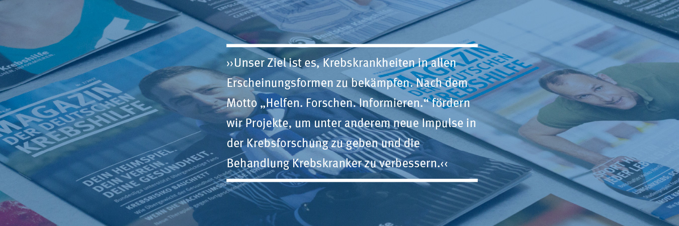
Design with recognition value
“The contents are displayed even more clearly now – yet the three pillars of our work HELP.RESEARCH.INFORMATION remain recognisable. Through the infographics and the new image composition, our magazine appears both appealing and contemporary.”
Christiana Tschoepe, German Cancer Aid Foundation