German Cancer Aid magazine


A breath of fresh air
THE TASK
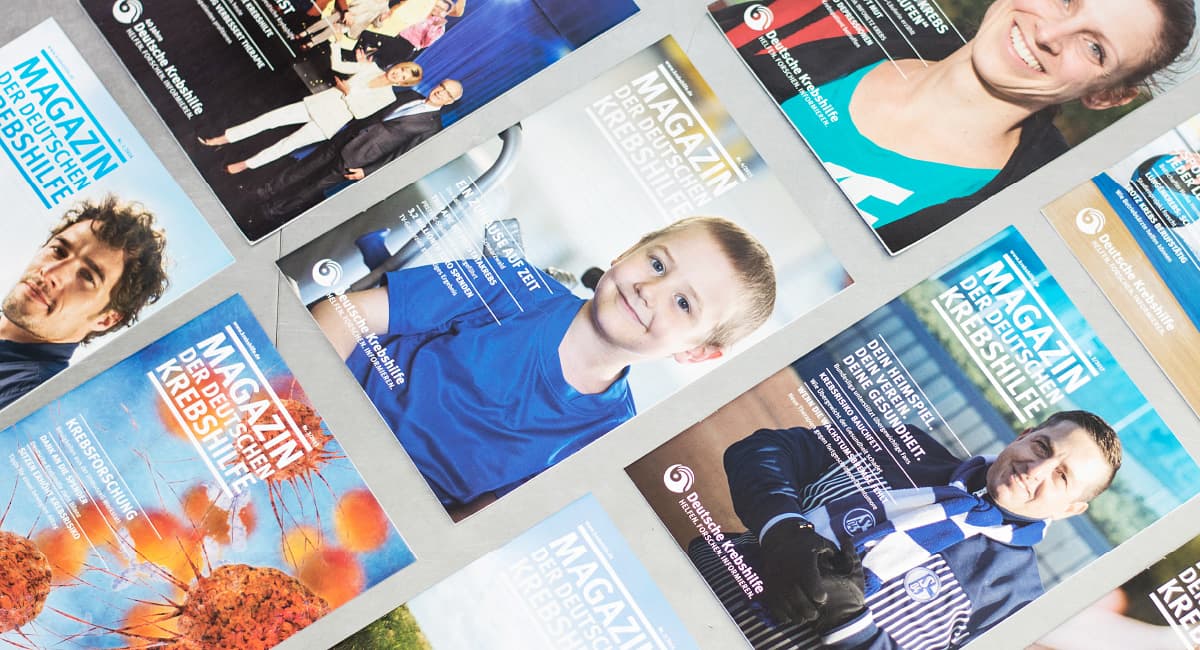
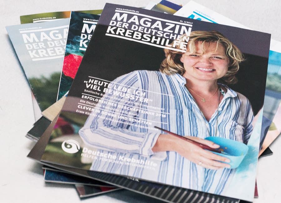
Deutsche Krebshilfe (German Cancer Aid) publishes a quarterly magazine for its donors. When its website was relaunched, the magazine was given a refresh as well. The challenge: the format and scope were to stay the same, and the sections and overall concept were to remain recognisable – yet the magazine still needed a visual update. The goal was not a reinvention, but an evolution.
With attention to detail
OUR APPROACH
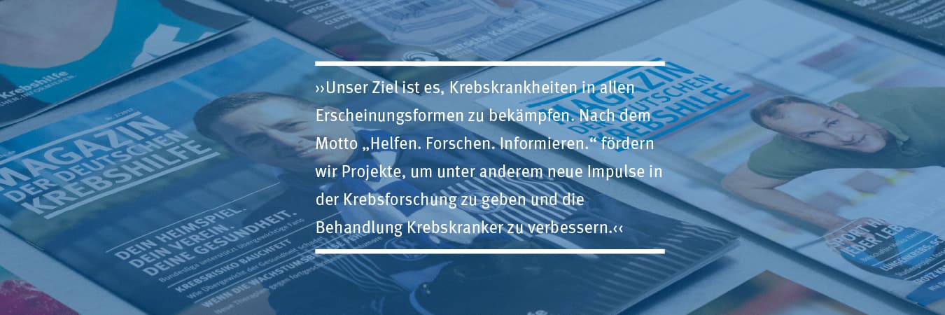
“The details are not the details. They make the design,” as Charles Eames observed. True to this motto, we set about modernising the editorial design. How do we expand the design palette? How do we create the right interplay between text and images and bring a breath of fresh air to the pages? In close collaboration with Deutsche Krebshilfe, we developed a concept based on subtle changes that preserves the magazine’s character and highlights its strengths more clearly.
Evolution, not revolution
THE RESULT
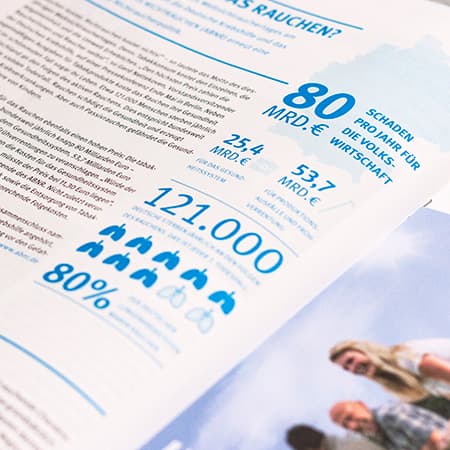
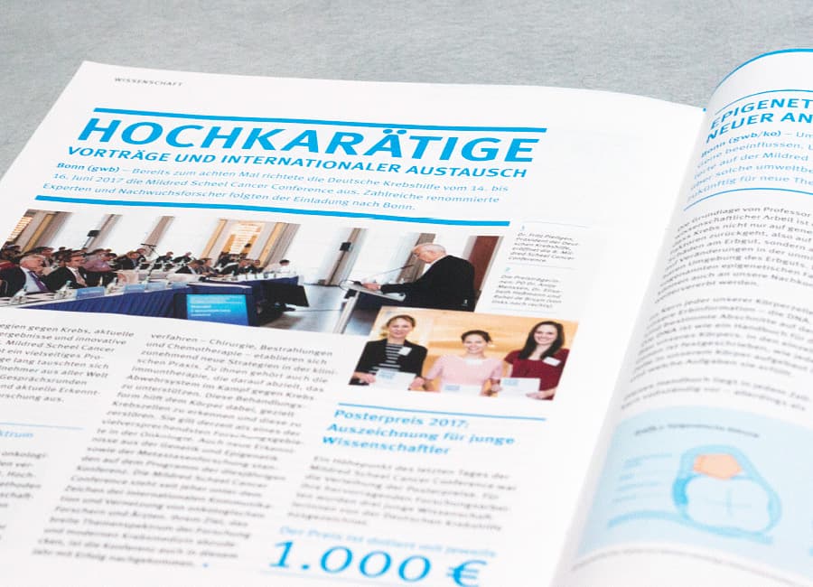
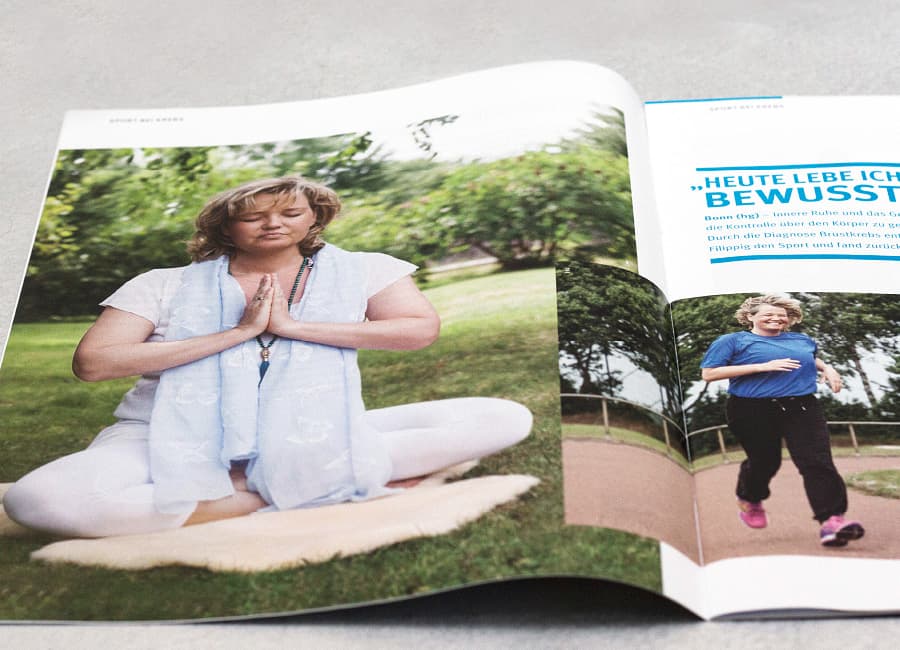
The magazine’s headings and subheadings now shine in vibrant cyan blue. Personal quotes run throughout the entire magazine, creating a narrative thread. In the science section, carefully researched and clearly designed infographics illustrate the content. A new imagery concept loosens up the layout grid: overlapping images and more white space add dynamism. The “Our donors” section, which showcases dedicated fundraising initiatives, is highlighted in orange.